All the changes I made last week meant a complete re-design of the second level’s layout. It’s been a fun process watching it go from an embarrassment to something I’m having fun with, and it’s got me thinking about what constitutes good level design. I’ll take you through my thought process so far, and maybe it’ll apply on a broader scale (but probably not, haha.)
First, I had to think about what purpose non-boss segments are actually serving. Bleed 2 is an action-packed boss bonanza, so it’s tempting to dismiss everything in-between as a formality of the genre, or the filler between the main events. However, I’d argue these sections actually improve boss fights because they break them up — if the game was just back-to-back bosses you’d grow numb to the thrill of fighting them, and they wouldn’t feel as special or exciting.
So in this case, the non-boss segments are a palate cleanser to get you ready for the next big fight. Once I understood that, I had to figure out the best way to create segments that perform that function. I decided on some key points: they should be short, easy to navigate, maintain interest, and above all make the player feel powerful. I’ll briefly explain how I tackled each point.

Short
In general, I try not to let any segment go on longer than 20sec. Specifically, I have a rough time allowance for how long I hope each overall level will take a skilled player to beat. I put time aside for the boss fights first, and then divide the remaining time among the non-boss sections. I have metrics on player movement — for example, it takes about 10 seconds for Wryn to run 200 tiles — so once I know how long a section will play for, I know what size to make it in-game.
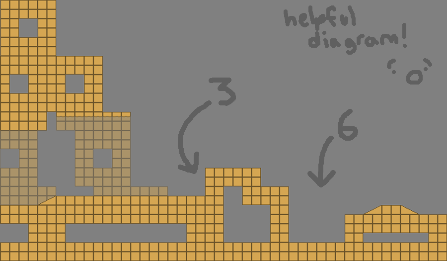
Easy To Navigate
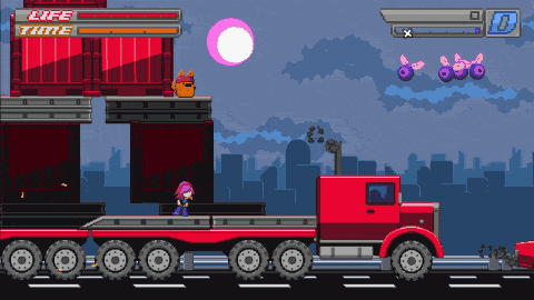
I have measurements of Wryn’s other abilities which I refer to when creating levels, so I can design them to be generous and unambiguous. I know Wryn can jump across 12 tiles and up 4, maximum — but I never ask her to jump across more than 8-9, or higher then 3. I stay away from raises of 5 tiles, or gaps of 13-14, for example, because they look kinda-sorta like Wryn could clear them, even though she can’t. Technical platforming isn’t the focus of the game, so I want it to be straightforward.
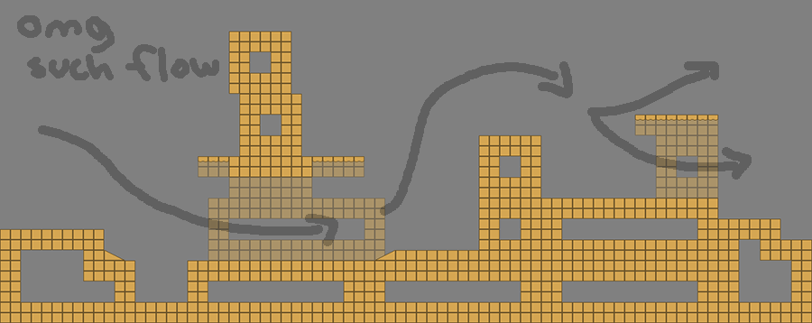
Interesting
I try to keep varying the environment’s elevation and the direction it asks you to move in, as well as giving the player a few opportunities to use each game mechanic, like the triple-dash or bullet reflecting. I vary the length of each segment, and try to introduce a unique element in each area… anything I can do to keep the player engaged, and make the experience an active, interesting one.
Make The Player Feel Powerful
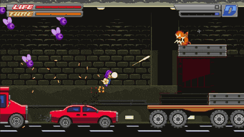
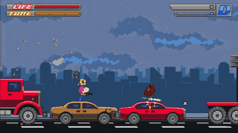
And finally, I try to populate levels with hazards to dodge, elements to reflect, and many weak enemies that are in prime position to be killed. I don’t mean that they’re just right in front of the player (which gets boring) but that they kind of set each other up to die. For example, big energy balls go through small enemies, so a Kitty’s reflected energy ball can be used to take out a whole swarm of Lil’ Guppies if you aim it right. It just feels cool, and I want the player to feel cool, man.
Aaaaand there you have it! Hopefully, by the time someone has run through one of these non-boss sections, they’ll be feeling refreshed and badass and emotionally ready to face the next big boss fight! If you made it this far, thank you for reading everything and have a great week! (Really, I want everyone to have a great week — but you’re the only one who knows it.)